Thursday, 28 June 2018

Load testing and insights

In this post the visualisation/ml web application is load tested with JMeter. More about the application here. The setup is described in the following video


The application architecture is here

The first run performs a load test on a single deployment cell i.e only one application server in the pool. The rest of the architecture remains same. In the second run 2 deployment cells are load balanced and JMeter is pointed at the load balancer. 

In both runs the application is tested with load slightly more than expected load. In addition to monitoring and understanding server resources and the application stack under load, we can also notice expected and unexpected application behaviour. As we will see in this post, monitoring the application logs during such tests can also help with identifying and addressing some blind spots.  

Topology

#Load balancer: 1 Nginx deployment
#Web app servers: 2 vms
#Database hosts: 2 vms
#Media and assets hosts: 1 vm
#Memcached hosts: 2 hosts
#Celery hosts: 3 (2 shared with memcached hosts)

JMeter test details

#Users: 100
#Ramp up: 10
#Loop: 4

Listeners

Graph results: This give an overall throughput number.
Response time Graph: For each sample (app in this setup), a response time is plotted. Helps to compare apps. Say, for example the Equake app and the WordCloud app in project.

Each of the application pages are accessed twice as many times as the number of pages in each loop.


In the Django project, the Equake app is heavier than others. It accesses Leaflet for map tiles, remote external REST APIs and caches results. It is expected that the app will have a few requests (the ones that trigger cache misses) that will be slow. A timeout for accessing external APIs is set to 4 seconds for the Equake application. Load test will reveal the impact Equake app exerts on server resources and other apps like WordCloud, tax statistics and Dota2.

Results

Without load balancing

Test time: 30 mins
Throughput: 922.498 per minute
Response time graph is shown below


As expected the Equake app home page for the live earth quake view (yellow) has spikes. Other Equake app pages like monthly, weekly and daily earth quake views timeout at 4 seconds. The rest of the apps have high response times along with equake but not as much.

With load balancing

Test time: 5 min 22 seconds
Throughput: 1707.32 per minute
Response time graph is shown below


All apps except Equake have gone down to response times less than or between 200-300 milliseconds. The Equake pages that access external apis timeout on 4 seconds. The home page (live earth quake view) for equake app has a maximum response time of ~ 17 seconds compared to 1.5 minutes without load balancing.

Insights

1) Throughput increases close to a factor of 2.  

2) All apps except the Equake app behave consistently as expected under load. They start off with a response time of close to 1 second and quickly drop down to <= 200 milliseconds. Caching also works predictably as seen in the application logs. 

3) So, from the load test what is happening with the Equake app?

The remote external REST API has a high response time. But, this should go down like the other apps as caching is enabled. Application logs reveal that there are cache misses for the fetched external REST API data. Data was being fetched. But monthly and weekly earthquake GeoJson data are too large. Around 5-7 MB when saved in file. The default entry size in Memcached is 1MB. So it was being discarded just like that. This causes the entire data to be fetched again. Memcached entry sizes can be increased with the -I flag. However, this means that ~ 7-8 MB of data will be fetched from the cache each time. For this type of data the size will also differ. 5 MB for this week's Equake data and 8 MB for next week. It would be better to use dedicated cache with increased item size limits. Memcached pools with different item sizes can be setup. Regular apps can use the default pool and apps with greater entry size requirements can utilise the other pool. Another approach would be to host the Equake app separately on dedicated app servers. Yet another approach would be to chunk the data and store it in the regular Memcached pool. 


Sunday, 10 June 2018

Signup form with Capthca and User profile/preferences page


Two new features have been added to the visualization and machine learning application.

1) Sign up form for new users:

This form asks for basic information from new users to create their account. This form is also protected by the Captchas app developed in the previous iteration. More about that here

2) A User profile/preferences page:

The application has been updated with a user preferences page. This page allows the user to change their settings within the application. At present users can change their
  • Preferred timezone: This is the timezone in which the user wants to view data in.
  • Profile picture: An avatar shown on the navigation bar and in profile page.

Tuesday, 24 April 2018

Implementing Captchas


"Completely Automated Public Turing Tests to Tell Computers And Humans Apart (CAPTCHAs) are challenge-response tests used to determine whether or not the user is a human" -- Wikipedia

These are used to ensure that a human is indeed in front of the screen making a web request. Sensitive parts of application are protected with captchas. A form that adds data into a database may need to be protected from accepting automated postings. Without protection, a stream of automated posts can not only just swamp the application but can also fill the database/disk with valid junk. For example, gibberish in a feedback form. 

Contemporary captchas are usually one of the following

1) One image or a set of images with a challenge question
An image will have text in it. The user has to type the text into a box. Another type is a set of images and the user has to pick a subset of the images. Say you are shown 4 images and there are animals in only 2 of them. You have to select the correct ones with the animals.

2) A click request on a box
3) An audio playback 
4) Even a short video playback can be used

The last two have storage and bandwidth impact on a web application.

Requirements 

A pluggable captcha that can be used in any Django web application. A mechanism to add and configure captchas with challenges. Once a captcha is added, the system must pick it from there. Captchas have to be one level up in difficulty. i.e something more than just 'enter the text', although these can also be used. 

Implementation

A single image captcha with additional semantic requirements is implemented. A reusable Django app 'captchas' holds the model, form etc to select and process captchas. The template can be included in any HTML form. The default display is as a Bootstrap4 card. How and where this card renders on a form is up to the page designer. Django views just need to send a form in responses for GET and process the submitted form in  a POST. The validation of the captcha is isolated in its form.

The add web page functionality in HUD application is protected with these captchas. This implementation can not only ask for just the text but can also ask for anything based on the image. This iteration includes captchas with challenges like 

- Type the text
- Type only the numbers seen in image
- Type only the letters
- Type the last four letters in reverse

Examples are


Or anything that can be inferred from the image i.e the challenge is configurable as shown. In this iteration basic colored images were used. Using strike throughs, blurs and other effects and on the images can further confuse models. It is also important to change the size of the image as it will slightly increase processing cost.


Advantages

1) There is a one-to-many relation between the images and challenges. With many images and challenges this approach can mitigate the effect of a sweatshop. A captcha image will show up with a different challenge thus mitigating image signature based attacks. If an attacker is getting past the security then it has to be on expensive discipline.

2) There are online free captcha services that can be easily integrated  to sites. However, these tend to have one or another pattern. The popular services may have already been subjected to continuous automated machine learning to created models. Such models are posed with a custom unfamiliar challenge thus making it difficult.

3) Ability to change the challenge over time allows for reuse. This is because it is the challenge that can hold a semantic requirement on a static image.

4) Even if the captcha images are harvested from the application, the challenge remains unknown. The challenge on a harvested image can be changed to a more complicated question.

Saturday, 7 April 2018

Migrating to Bootstrap 4

This post lists the effort in migrating HUD project to the latest stable version 4 of Bootstrap. Screens from mobile, tablet and wide screens are posted at the end.


Project details


# Web framework: Django 1.10
# HTML files / Templates: 66
# Custom css files: 10
# Effort: 4.5 days

Approach

Branch out and import Bootstrap 4 into the project. Things will look out of place. Go through official Migration Guide for each user interface component used and adopt changes. 


Notable points

Panels: There are no panels in bootstrap 4. If you have been using a lot of them, then you need to find and replace them with cards. Migration details link.

Cards: These can do all that panels did in the application and more. So moving was not fruitless. The most important advantage in the application is the better ux on a really small mobile, through the tablet to desktop. It was easier to create a tile like structure with images out of cards. Previously this was done using custom css. 

Navbar: A number of changes in the classes for navbar elements. Glyphicons are no longer part of bootstrap. Although this was not much of an impact, it needs to be brought in manually. The new approach can avoid nesting of ul li and a tags to create navbar items. In the new approach, a dropdown-menu class can be applied to a div. And a dropdown-item class make an a tag a drop down item. While a nesting with li is avoided. This can wreck havoc if there are css combinators applied to create custom navbars.  There was limited impact on the project and css was migrated. Migration details link. 

Display/hide: Some classes have been dropped altogether. For example, hidden-sm was used to hide a component on small screens and save space on the navbar. This has been replaced using a combination of screen size and values as .d-none .d-sm-block.  This is explained here. image-responsive is now image-fluid.

Forms: It is always important to keep forms simple. This is one part where both users and developers can make the layout complicated. Forms were kept simple in the application and migration was not much of a problem with changes listed here. Labels have new classes and also to control sizes. Again, help-block class for help text is now form-text class. This is a better option in a Django application. The error check in template can be moved outside the element.

Grids: Although this can appear daunting, a quick read can help to push through the changes. In reality the addition of a tier helps finer control of flexible display. For example, the application after migration was tested on a portrait mobile device (Lumia 630!), portrait + landscape of tablet and wide screen laptop. Screen widths at which the transition occurs has changed. The exact details are here. 

Margin and Padding: New formatted classes are in place. This helps to control the values for each break point. mb-4 is a simple one used where 4em is the bottom-margin. Another class mr-auto helps with right aligned navbar links.  

Flex layout: d-flex was used to create a container to hold the avatar icon and user name in the navbar. More about Flex here. This was used in conjunction with mr-auto the new margin classes to right align the avatar and user name.

The effort was worth it when viewed on multiple screens. Some screens mobiles, tablets and desktop.

Mobile 480 x 854 pixels


Samsung Galaxy Tab S2 1536 x 2048 (portrait)


4K Laptop

Friday, 30 March 2018

Speeches: Content Analysis


Visualising topical content of 5 speeches

1) 'Duty, Honour, Country' speech by General MacArthur
2) 'Why I killed Gandhi' speech by Nathuram Godse
3) The Cuban Missile Crisis Address to Nation by President Kennedy
4) Pearl Harbour Address to Nation by President Roosovelt
5) The League of Nations talk by President Wilson


Sunday, 11 February 2018

Updated* Machine Learning | Insights from Visualisation | Multi-dimensional data


Data sets for machine learning are multi dimensional. The number of dimensions depends on the data domain. For example data for a collaborative item-to-item recommender includes a user and an item. This can easily be fit to a co-occurrence matrix. However, data from medical diagnosis have more than 3 dimensions. This is the same for air pollution measurements, vehicle stats and other data sets. When the number of dimensions is 5 or less, it is easy to visualise data before deciding on an approach to machine learning.

Visualising data before applying machine learning has advantages.

1) Visually identify unique patterns in dimensions. Those dimensions are likely more important to help in decision making.

2) Help to decide candidate model(s). For example, would it be better to use a Random Forest classifiers or Support Vector Machine or Nearest Neighbour Classifier?

3) Select a subset of dimensions (before model fitting) that are more suitable for machine learning. Not all collected dimensions turn out useful. Subsequently adding dimensions leads to different use cases and insights.

The rest of the post is divided into
1) Visualization
2) Prediction results using Classifiers
3) Plotting feature weights from fitted models to confirm insights from visualization.

1) Visualization

The sample data set for this post is the Breast Cancer Wisconsin (Diagnostic) Data Set from University of California, Irvine Machine Learning Repository. The dimensions are measurements on cell nuclei. There are 30 dimensions. How are the Benign and Malignant cell readings distributed across the dimensions? In other words what is different between Benign and Malignant cells? Visualising the data on parallel coordinates gives a sense of its dimensions. (Red=Malignant Blue=Benign)


 As an example the perimeter dimension in the top chart is interesting. Filtering based on that looks like this.
While the perimeter dimension cannot help with a binary decision, visualisation shows that the compactness and concavity dimensions can help to decide from that point on. When you go through the above visualization and interact with it, notice that it looks more like decision making. So is this data set a good candidate for Random Forest Classifier or Nearest Neighbour Classifier or SVC?

2) Prediction results

Applying these classifiers to out of bag test data yields different levels of accuracy in prediction. Random Forest Classifier is more accurate than Nearest Neighbour Classifier. The result of applying these classifiers is shown below. RandomForestClassifier/GradientBoostingClassifier is the best choice as was clear from the visualization,


3) Confirm dimension insights from visualization
Fitted tree models have an attribute that shows the weight of each dimension. This allows us to confirm if the dimensions we thought were important from the visualization are really of any predictive value.

From the two plots notice that the dimensions radius, perimeter, concavity, concave_points have more weights than others in both classifiers. Notice that the standard error dimensions are less important.


Tuesday, 23 January 2018

Multi-DB design for high performance web applications


Applications with a small user base employ a design with a single centralised database. The rate of data growth and load do not create contention for such applications. So a single db design will work well. However, each database has a maximum connection limit. PostgreSQL is 'good for a few hundred connections, but for 1000s it would be better to look at a connection pooling solution'. Caching and db connection pooling can be utilised to postpone hitting the limit. This single db approach is easy to maintain, test and orchestrate with developer operations. 

When there are specific performance requirements for #users to support, #api requests per second, read/write patterns and data isolation the single database design would be broken by design. Hitting its upper limit on performance/load will impact users. A competition that has a better design to address this will win. A multi-database design addresses the shortcomings by separating data across multiple databases.

A) Data can be logically partitioned. For example, user authentication and profile information can reside on one database while other application data like say catalog, reviews and feedbacks can reside in a different database. That way authentication connections are routed to that specific server while the other servers can utilise connections fully to provision data.


B) Another approach is to partition based on read and write operations. All writes will go to one database. This database will be periodically synced to another read-only database. This helps when there are regular writes to the db but, the read density is too high. Multiple read-only slaves which mirror the primary can be used as needed.


C) A third approach is to use dedicated databases for different regions/locations. This is useful when usage varies across locations. Each database can be configured differently to handle its own access/load patterns. For example, utilise separate databases to store data from each state, New South Wales, Victoria, WA and so on.


D) To partition all data with redundancy, it would be better to use a database that has sharding built into its design. MongoDB is a good choice. This is described in a previous post.

Multiple databases mean more effort in development, operations, support and maintenance. So tangible performance benefits must justify their use.

Friday, 29 December 2017

Australia Tax Stats 2011-12 | Visualisation & Insights


This post visualises Australian Tax data for Individuals during the income year 2011-12. This web application allows the user to explore tax filing data to derive a number of insights. The data is available from the Australia Government website here. 

Watch the video for a look at this application. 

Specific Insights
============

1) Size of the workforce has not changed much: If the Wikipedia page on Australian economy is correct, then the workforce has not changed from 2011-12. The workforce count on the data confirms this.

2) Workforce made up of Equal numbers from both genders: Tax data shows that almost the same number of men and women figure in the filings.

3) State-wise gender gap in registered salary: Data shows that women, when compared to men, although roughly the same number in the workforce as men have their cumulative salary field at half the $ number in WA. This gap varies for the states. Since the number of women is almost the same, this wage gap triggers cause-analysis such as:

  1. Women are paid less in the same job compared to men.
  2. If (1) is not true then, women are not in the same pay band/scale or jobs as men are in. This would explain why the salary is less even though women make up the same head count.
4) Taxable Income/Salaries for under 18 age and above 70: The data shows that there is healthy income (but < 1 Billion) for these two age groups.

5) Comparison of states: On all accounts the ranking is NSW, Victoria, Queensland, WA, SA, TAS and other.

There are other data points like child support by filing individual, refundable, exemptions etc which can be analysed.

Thursday, 14 December 2017

Data visualisation: Plotting USGS earthquakes

This post makes use of USGS's live feed of earthquakes. The feed is plotted on a Leaflet map to visualize the data. Leaflet is a javascript library for interactive maps (http://leafletjs.com/). The advantage is that it consumes Geojson well.  


Feeds are categorised into all quakes and significant ones. The app's hourly feed is updated continuously for new data. When new data is available the map is updated. For each point of interest a leaflet layer group is utilised. This holds a circular marker layer and a place holder. A popup layer is also added which displays a text with the title from geojson. This title includes magnitude and location of the quake. All layer groups are added to the map's layer group. This allows individual layers associated with a point to be update or removed when data is updated.

Although all earth quakes are not significant, from the data is clear that earthquakes are more common in plate boundaries and fault lines (not surprising but nice to visualise). Switching to a weekly or monthly view makes vulnerable locations apparent.

Significant quakes are also seen in daily, weekly and monthly basis. Adding filters to query on Magnitude or changing the circle marker circumference based on magnitude would be good. However, significant earthquakes are far less in number and are shown separately in the app. Also to be noted is that, leaflet slowed down when a lot of layers were used for each point to support individual point updates. It also eases out when the map is just cleared and updates are added.

Tools:

Python 3.5.3
Django 1.10
Postgresql
Bootstrap 3.3.7
Leaflet 1.2.0
Javascript, JQuery
Geojson

Wednesday, 1 November 2017

Building a recommendation engine for Dota2

This post builds a recommendation engine that suggests heroes for a Dota2 player. This was one in a 3 set requirements to be completed. For more about Dota2 read on wikipedia and this. Two other requirements include player comparison and a leader board.

The application that was built looks like this.


Requirement: Dota2 has a set of 113 heroes and a huge community of players. The requirement was to suggest a hero for a given player. The recommendation engine should take into account play history of the specific player and heroes. Dota2 open API documentation is available at https://docs.opendota.com/ and the application must use this as a source of data for recommendations. The API for the solution must be available as REST and also on a web page. 

Approach: The solution is built as a collaborative item-to-item recommender. The data set for training and building the recommender is available from this api. An example for this api call to dota2 looks like this https://api.opendota.com/api/players/87568060/heroes?date=30 The result of this query has the hero play history (30 days back) for the player with id 87568060. For a list of players this can be utilised to build a data set. The advantage of using this api query is that it fits the recommender well as it has the play history for the heroes (by the players). And by using the data for all the players it contributes to the collaborative nature of the recommender. The resulting data set has the following columns and rows for each player to hero game plays.

player_id -> steam id for a player  
hero_id  -> id of the hero
plays -> number of times that this player played the hero.

This information is used to build a co-occurence matrix of all heroes to the player's heroes. This matrix is normalised using Jaccard index and a sorted weighted sum is applied to get the list of recommendations. Dota2 open api allows only 3 requests per second. So memcached is used to cache results of the external dota2 api call. The data set is divided into training and test respectively. The matrix is built on the training data. The matrix is built as follows


The disadvantage of this approach is that there needs to be a play history in place. Otherwise the matrix would be zero. This is the same for a new hero. One approach is to suggest a set of easy to play heroes to beginners. Again, this implementation builds the matrix for a subset of the players or for the whole community. The first case can be modified to build the matrix for only play history of beginners which would take into account hero plays of other beginners (collaborative).

Tools used:

Python 3.5.3
Django 1.10 & Django REST Framework
Pandas 0.20.3
Postgresql 9.5
Memcached
AWS EC2
Bootstrap

Reference:

For a good basic introduction to recommender systems see
https://www.youtube.com/watch?v=39vJRxIPSxw


Tuesday, 17 October 2017

Django models: I will cache you if I can

This post presents a generalised approach to making cache keys for Django model from fields and related one-to-one fields. In the last post  a Django model based approach to cache keys was utilised. However, that results in code duplication for the purpose of generating cache keys. At first look that appears inevitable since each model is cached in its own way. However as more requirements come in, a pattern can be identified and code duplication can be avoided. This new approach to making cache keys is enabled by a base class that inherits from models.Model and provides mechanisms to generate keys. The cache key generation takes into account what model fields the key has to be based on. 

For example, if there is a Player model with fields id, email, username. We may want a cache key that would look like 'model.used.id.<the_id>'. Same for email and username. However, what if many fields of a model need to be in the cache key? This post presents a solution. Again, what if there is a one-to-one model which has a foreign key back to Player and that model needs to be cached ? For example, consider a model PlayerStats with fields id, user, stats. When this model needs to be queried it is likely to be based on the user. So, it makes sense to have a cache key for PlayerStats based on its linked player. Since this approach takes in any field, this becomes easy. The base class is


The class methods give back the cache key template and the instance method generates the cache key for the instance. The template is needed when some model's fields+values are available and we need to check the cache for those. Example is a web request asking for User with id=10 and we want to check that if that user is in cache.

The Player model will inherit from CacheableModel,


The PlayerStats looks like this


Now all that remains is a utility that takes in Model classes and calls the two class/instance methods.


- Now when Player needs to be queried on id, say from a Django view it becomes as easy as.

model_ins_from_cache_by_fields(Player, {'id': steamid})

- For Player stats for a specific player, this becomes

player = model_ins_from_cache_by_fields(Player, {'id': steamid})
player_totals = model_ins_from_cache_by_fields(PlayerTotals, {'player': player})

That is saving a lot of "if in cache else" code from repeating in views.

Some things to keep in mind:

1) Notice that the __str__ of the models is used for building keys. So make sure that __str__ of models do not have spaces and control characters.

2) Since it is based on __str__, if the __str__ represention is too long then the cache key becomes too long, possibly to the extent of increasing the time of hashing for the key.

Both these are addressable and is left as homework for reader. ;-)

Wednesday, 30 August 2017

Tuning the word cloud: Nuances with Mobile-support/REST-api/Cache

The word cloud web application in the previous post has been updated with the following features.


1) Mobile/Tablet support using Bootstrap css.
2) Configurable ignore lists to reduce noise in the cloud.
3) Caching.
4) REST.

1)  Mobile/Tablet support

Bootstrap makes the app usable on various device screens. Bootstrap intro page here. A page from the application now looks like this.


2) Ignore list via Configuration 

A web page can now be set with a list of words to ignore. There is no point so far in counting the word "like" on a social media page. Now the application can have words associated with lists and those lists associated with a web page. i.e configurable ignore lists. Example.


After applying an ignore list there is visible reduction in noise. (before Vs after).


3) Caching

This is most challenging in any application. When the data has not changed in the db, time spent on db/disk accesses for the same can be saved thus improving app latency. Memcached is used on 2 hosts and the application is configured to use the same. When a page is requested, data access is first checked against the cache, if it is a miss then only the db is queried. This data from the db is cached right away so that subsequent requests for the same data return fast. Common challenges in caching is described below. It is important to develop a feature without caching and then put the caching logic in. Screens show cache hits/miss on 2 consecutive requests for the same data. The second request returns from cache hits.


4) REST API

Data needs to be provisioned in a way that can be consumed by mobile applications, web apps or any program that wants to talk to your application. REST is good especially for native mobile applications that need the data but, handle display on their own. Django REST makes this manageable with a few quirks of its own. A rest response from the application using Chrome is shown and the same is accessible using curl command too.


The rest of the post is about common programming challenges in DRF and caching.

DRF challenge

DRF is good at so many levels. However it is tightly couple with the queryset. So if there is a list of instances rather than a queryset, things become incompatible. For example, customizing a foreign key related field to use cached data before hitting the database. While this may be a remote requirement the problem is well explained here. Curiously, Django1.10 has a new feature that lets queryset api with instances list. This api feature is described here. So if the instances that match are already in the cache they can be used. DRF serializer can be made to work with model instances like


The eager loading idea is from here but has been modified for the specific requirement with instances. After this what remains is overriding the get_queryset on the rest view. Works with Django 1.10. If the api is heavily used and database accesses can be saved, it is worth the effort and work too.


Caching Challenges


1) What to cache? 

To avoid access to the database, it is common to cache database entries. Images, static pages and json responses are also cached.


2) Cache code: 

Where to put it? How generalized should it be? Good cache key? In tutorials it is common to see cache access code and if that fails the object is retrieved from db and set to cache. This is leads to a lot of duplication of code. It is better to identify common sql access patterns to the db and cache those. The code that caches the db can be set as a behavior of the database entity or coded as a utility. Example for cache access logic as part of the db entity facade/ORM. This orm approach is described here.


Modify that for reuse: common accesses like the above on primary key can be factored out for re-use in a utility module.

Some access types are difficult to generalize and doing so can make the code base difficult to maintain. For example, fetching an entry in table A that corresponds to a foreign key. While it may be tempting (and feasible) to make a utility for this too, it is better to leave this alone until replication makes the use-cases clear and creates a demand for factoring this out into a utility.
  
What works in terms of generalizing the cache code depends on how many requirements come up. After a number of use cases, a general pattern should emerge in any application, like the primary key and foreign key access above.


3) Cache Key? 

A good cache key is one which describes the cached content. Also it should not be so long that the time to compute the hash beats the whole purpose.


4) Cache invalidation? 

If the data that is cached has changed then the cache needs to be updated. If the data is updated at many points in the application, it may become difficult to keep track of this. The example shows a signal handler that updates the cache on a db update/save. This approach works well.


5) Cache loading

Finally, when the application starts up, it is good to have the cache initiated with some data. What qualifies to be loaded to cache on startup? A fixed number of entries/tables with fixed row count or most frequented data points make good candidates. The application data, UI and usage need to be analyzed to determine the same. For example, data that corresponds to drop down lists with fixed number of entries. Say the names of states in a country shown in a drop down list.

Saturday, 12 August 2017

Word clouds: Text analysis for interesting patterns

This post utilises text analysis to identify trends in popular web pages. Of interest are home pages of news sites, Twitter pages of popular personalities and other sites where content changes frequently. Analysing words and projecting to a cloud provides a visual representation of text data which in turn helps to quickly perceive overall changes in trends and interests. Here the cloud is generated on content from Saturday and Sunday.


About the application:

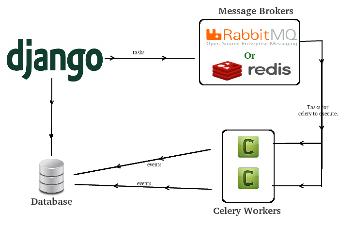
The web application generates a word cloud for each submitted link at a given time. The application first generates a word count for each page using natural language tool kit and stores the results in a database. The counts are converted to a word cloud using opensource javascript libraries. Web links can be added to the application as needed. The word count task is performed asynchronously using celery worker nodes. 

Software built using:

Django1.10/Python3.5, Asynchronous tasks using Celery 4.1.0, Javascript, Natural Language Processing Tool Kit (NLTK), Postgres Database. 3 hosts. One for web application, one for celery workers and Database and third for the message broker. 

Home pages analysed:

RT.com
BBC.com
Google News
Fox News
Indian Prime Minister Twitter Page
Obama Twitter page
President Trump Twitter Page

Celery Django Architecture

>> Word cloud on Saturday to left and Sunday to right

RT.com

BBC.com

Fox News

Google News

Obama


 President Trump and  the Indian Prime Minister Twitter Handles